Monday, 19 April 2010

Friday, 16 April 2010
Evaluation
In what way does your media product use, develop or challenge forms or conventions of real media products?
My video uses many conventions from similar music videos of the same genre, the colours, the actors movements and costumes were all conventional of hip hop and rnb music videos. In most tinchy stryder music videos there is no narrative, our music video has developed this as it has a narrative and there is a story behind the music and not just the performance side of it. We have also challenged and then developed the way women are usually represented in not only tinchy stryder videos but many other hip hop and rnb videos. They are usually represented ‘sexy' and conveyed in a not so respectable way we have challenged that by not having a woman their just to be objectified and attract male audiences we have a woman who is respectable which is a development as well. We have adhered to conventions about colour as we have a simple but effective white background. Flashbacks are also shown in black and white which is a convention of rnb videos as well as the characters have bling which also is conventional.
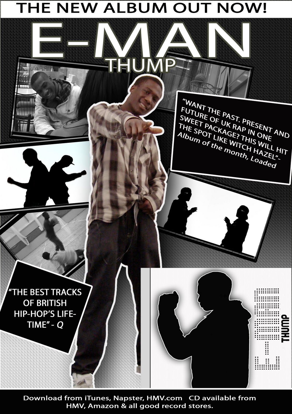
How effective is the combination of your main product and the ancillary tasks?
The ancillary tasks are effective together for a number of reasons. The ancillary tasks share the same themes of colour with the actual music video. They both use mainly white backgrounds with places which hint black such as the silhouette style of image in the CD cover and the gradient shift from white to black in the magazine advert. The main image of E-man our artist is on both and his name and the name of the album written boldly. In the CD cover E-man is also doing a dance move which looks like thumping, this goes with the name of the album, ‘Thump’ and also connects the album to the video, the single ‘Thump’ being the main single.
What have you learned from your audience research?
From the audience research I learned that both genders are to be represented as ‘sexy’ but men are to be dominant while women are meant to be respectable. We have also learned that most people only want the song and don’t watch music videos for the video although it’s also important to have a music video which helps the artist to show what his view of the song means on the other hand people are also meant to take their own interpretations of the song that could help them enjoy it more. People prefer the use of black and white to show a flashback. We also learned about what costumes the audience would expect from this sort of video; from there we got ideas for props such as jewellery and hats and also ideas for the types of colours that would be conventional for the genre. Locations were chosen based on the feedback and what story we wanted to convey though the music video.
How did you use new media technologies in the construction, research, planning and evaluation stages?
Over the course of this media production, I have used a variety of new media technologies such as video cameras and tri-caster/ green screen to film scenes for the construction. It was edited on premier. Photos were taken for the ancillary tasks which were edited on Photoshop. The research and planning was done on a PowerPoint where music videos from Youtube were analysed. Audience research in the from of a vox pox which was filmed and edited on premier and uploaded onto Youtube to then be embedded onto the blog. The PowerPoint’s were uploaded onto the blogs using a site called slideshare.com. Premier has many tools such as ‘cut’ and volume manipulation; it also has many effects such as ‘horizontal flip’ and ‘fade to black’. Using the tri-caster gave us effects to add to the background before we digitally recorded footage. We chose a plain white background because it’s conventional. We also manipulated the lighting to make our models go completely dark over the white background which gave an effect which made them look like silhouette. We’re also expecting audience feedback on the blog itself from various visitors.


Wednesday, 31 March 2010
Sunday, 28 March 2010
Saturday, 13 March 2010
Wednesday, 27 January 2010
Ne-yo annalasis

States his name clearly and the title of his song underneath it because its white on top of the black and white background, it stands out more due to the contrast
The model image, which is a wide shot, show him walking closer towards us which goes with the title of his song
He is dresses very smart which shows his sophistication and it shows he is in an urban environment which are contrasting elements. Him being smartly dressed also shows his success as a musician and will make people want to buy his albums
their is high angle lighting to show its mid-day and low key lighting that makes us unable to see his eyes clearly which connotes mystery
Wednesday, 20 January 2010

CD cover textual annalysis
This is a conventional CD cover since it has a picture of the artist and his name in bold and large typography which makes it very easily noticed.
The artists image is in black and white and he looks as if he is trying to hide himself using his hand. this goes with the name of the single 'look for me' so the modles image reflexts the title of the song which can be conventional
Icomes with a promotional free poster which can make people want to buy it thinking their geting more from this money
He is wering a black t shirt with jeans which represents him as a teeeager this shows that his music is aimed at teenagers
